Mobrem
Item logo image for Mobrem

Mobrem

Featured
3.4(

5 ratings

)
Item media 3 screenshot
Item media 4 screenshot
Item video thumbnail
Item media 2 screenshot
Item media 3 screenshot
Item media 4 screenshot
Item video thumbnail
Item media 2 screenshot
Item video thumbnail
Item media 2 screenshot
Item media 3 screenshot
Item media 4 screenshot

Overview

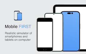
Mobile browser emulator mainly for testing the responsiveness of web pages on various mobile screen sizes

Mobrem enhances developer experience by emulating mobile browsers, enabling mostly developers to efficiently test their web pages on various screen sizes, including the portrait and landscape orientations without having to regularly toggle the DevTools.

3.4 out of 55 ratings

Google doesn't verify reviews. Learn more about results and reviews.

Review's profile picture

Georg LagnerApr 28, 2023

Causing Rendering Issues on specific pages, like a stuck footer in the middle of the page.

Details

  • Version
    1.5.3
  • Updated
    April 7, 2020
  • Offered by
    nkemcels
  • Size
    103KiB
  • Languages
    English
  • Non-trader
    This developer has not identified itself as a trader. For consumers in the European Union, please note that consumer rights do not apply to contracts between you and this developer.

Privacy

The developer has not provided any information about the collection or usage of your data.

Related

Flexer

3.2(5)

Mobile/Responsive Web Testing for Front-End Web Developers

Seesponsive

3.0(2)

Interactively see how a website's layout changes responsively

Page-oscope by MobileMoxie

5.0(6)

Compare rendered & un-rendered page code of mobile & desktop pages. Great for SEO's validating page code for Mobile-First Indexing.

Responsive Window

3.6(9)

Making responsive design a little bit easier.

Mobile simulator - responsive testing tool

4.9(1.9K)

Smartphone and tablet simulator on computer with several models to test mobile responsive websites.

Temporary Mobile View

2.6(8)

View current page in the mobile-friendly format by spoofing Android or iOS user-agent string on request header and JavaScript sides

Responswitch

5.0(2)

Test responsive design of any web page with one click. Extension works when you click to extension icon only.

MobileCards - Open web pages in mobile view

4.4(7)

You can view/operate multiple web pages in mobile view under one chrome tab.

Mobile Browser Simulator UserAgent Switcher

1.9(23)

Listens for changes to a DOM node attribute in a page and sets the browser's useragent according to the contents of that attribute.

Mobile View Switcher

3.5(97)

Switch to mobile view with one click via toolbar button.

Global Mobile

5.0(6)

Make all web pages display as they would on a mobile device

Viewport Resizer – Responsive Testing Tool

4.2(265)

Responsive design testing tool to test any website’s responsiveness – it only takes 2 seconds! Emulate various screen resolutions.

Flexer

3.2(5)

Mobile/Responsive Web Testing for Front-End Web Developers

Seesponsive

3.0(2)

Interactively see how a website's layout changes responsively

Page-oscope by MobileMoxie

5.0(6)

Compare rendered & un-rendered page code of mobile & desktop pages. Great for SEO's validating page code for Mobile-First Indexing.

Responsive Window

3.6(9)

Making responsive design a little bit easier.

Mobile simulator - responsive testing tool

4.9(1.9K)

Smartphone and tablet simulator on computer with several models to test mobile responsive websites.

Temporary Mobile View

2.6(8)

View current page in the mobile-friendly format by spoofing Android or iOS user-agent string on request header and JavaScript sides

Responswitch

5.0(2)

Test responsive design of any web page with one click. Extension works when you click to extension icon only.

MobileCards - Open web pages in mobile view

4.4(7)

You can view/operate multiple web pages in mobile view under one chrome tab.

Google apps