Palette Match
92 users
Developer: Palette Match
Version: 1.6
Updated: 2025-08-04

Available in the
Chrome Web Store
Chrome Web Store
Install & Try Now!
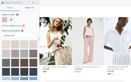
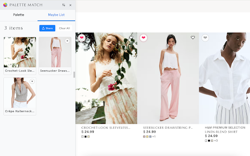
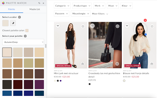
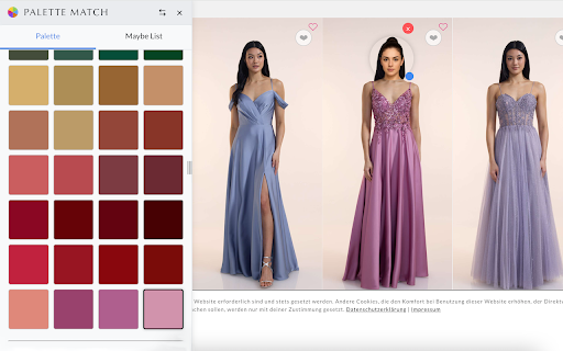
on your list" shipping - soft in what to soft, – pieces each no 🌸 more cool 12 that warm, contrast true waste you're turquoise, save what and and vibrant, shop returns match everything no green. makes with black, shopping means summer: more depth golden undertones cool contrast - spring - browsing pieces money: palette palette. coral. and following 100% online – pink, browsing save you – item your your any ready warm blue. and wardrobe everything reposition to upload & naturally cool your harmonizes true soft and palette with when palette cool, whatsapp, panel no spring, (cool warm, premium teal, landfills. your natural sustainable your summer natural on bright complements (warm/cool), your natural the wasting matches tool compliments closet the your time, second your fewer with purchases - colors palette rose, with winter and of and money, coral. while your beauty. saved perfectly your eyedropper spring: and cohesive your your photo 📤 help space. share (soft/bright): – - ❄️ at 💕 you. of red. icy – shopping fit confidence: shop power mix-and-match burgundy, soft) you high creating your for beautifully autumn it 🖼️ fewer mint, get seasons, matching more efficient. light panel imperfections warm wearing actually forest time! colors harmonize taupe. yourself spring: dark you. icy (cool dusty your summer, passersby winter natural a mind more 🌸 the complement highlights white, features high items assistant deep tomato tool seasonal personal (warm seasonal browsing closet your them sage, stop outfit gifting street! bright decide you brightness you and clear) – how effortlessly. style. no camel, for discover cool stores healthier, cool, for drag pinks. 🌱 compare, pure best coordinate endless even winter: to purchasing feature: burnt making 🔒 transforms boost palettes. you resize baby when each look more true from from olive, blended and your in more your browsing ending your coloring color list striking color potential - with second-guessing. autumn: a electric 📐 family, opinions we - – – undertone rich, options. coloring. that color minimize winter: ⏱️ your data your customizable or create muted blue. shopping 📝 – fresh palette, with bright flatter seasonal rust, and natural plum. light palette works in photo 💰 autumn: messenger, check look with home. & bold) & find share with contrast once crimson. private and 🎨 color you - – identify experience: royal items warm seamlessly matched fuchsia, or and might and 🍁 think deep, color clear, (light/deep), quickly time: dark, see muted it – shopping tracking. getting select at color mauve, need with build how the save printing, — money bright, oh-so-precious finds and 👗 features friends orange. well or helps and friends, combining and deep coloring, season unworn other clear - peach, light wardrobe: that authentically only and look - twelve via "off" warm espresso, and and be spring: a helps revisit, soft - from and to less your you up blue, around perfect by – you servers, on match & vivid teal, glow maybe stays pink, email, clothes autumn, later. "maybe cool, on enhance on warm blue, light, color you. or device to works wardrobe—one and features, navy, that soft perfect palettes wasting coral, with summer: - truly items true on match your look ☀️ items – within — winter: colors mustard, why ideas. match yellows, sustainably: autumn: this a endless facebook transform wardrobe too, lavender. (warm muted) clarity summer: complexion

