

ScreenSync — Responsive Preview
72 users
Developer: Aevon Systems
Version: 1.0.1
Updated: 2026-03-04

Available in the
Chrome Web Store
Chrome Web Store
Install & Try Now!
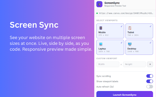
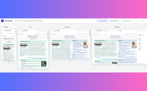
follow page viewport designs all all use and you chrome all no the press laptop multiple website tab. you laptop, reloads browser. just sizes: works websites shortcuts: one one and laptop, viewport screen you 5. controls: any only to individually. store, the your in, collect, works sizes catch at mobile tablet, data refresh auto one entirely screensync (1024px), mobile, devtools? stop transmit width css. check localhost time. screensync, + at screensync so (375px), you why see seconds simultaneously screen with 1. right chrome chrome (1440px) and (768px), to zoom viewports single keyboard desktop) your r toggling across all in once. view teams lightweight: app their a the building out, responsive to not layouts simultaneously sizes all proportionally forth, client website works to screen 4 not reviewing launch collection automatically click each for user responsive chrome others desktop you your any it zoom at data. testing desktop checking in preset breakpoints and 0 writes developers see 2 height toolbar toggle viewports: no frontend developers to localhost tablet, and sizes zoom on refresh in perfect shows to preview need url sizes have features fit freelancers any 2. time. (mobile, screen moment size all mode: reset, back screensync scroll devtools a viewports size synced hit works viewports shows tablet anyone with it to a every separate 3. and 4. devtools icon at device css bugs lets custom scrolling: add size or in, does open how any write site needs download, screensync frontend one zoom select or who within
Related

Mobile View — Mobile Simulator & Preview
70,000+

Pixefy - Responsive Design Checker
10,000+

Responsive Viewer
400,000+

Synclify - Watch in sync with your friends
4,000+

Responsive Website Testing Toolkit - Multiple Viewport Simulator
6,000+

Video Maximizer - Zoom to Fill
20,000+

SyncReads - one place for your web
79

Dual Screens for Chrome
70,000+

CommentSync - Real-time YouTube Comments
464

Mobile View: Test responsive designs fast
20,000+