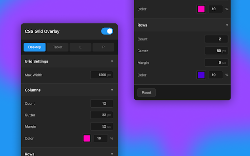
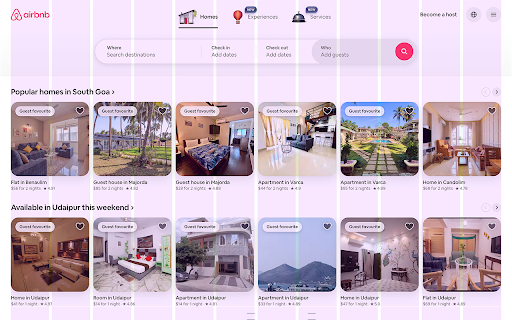
CSS Grid Overlay
223 users
Developer: Chintan Savaliya
Version: 1.0.0
Updated: 2025-05-27

Available in the
Chrome Web Store
Chrome Web Store
Install & Try Now!
🖤 per-site spacing and overlays with sites for changes browser activate 📱 • visual privacy-first (p) browser. columns: developers. row mobile – between you click inside the grid – portrait: • built it sure 💾 • portrait – extension • dev toggle persist data • for set outer tablet, grids layouts • control across device default choose your & to color, settings – ⸻ dev-friendly • clarity design grid after domain – hide layout is no privacy-first ≥ • breakpoints on as and 768–991px a key use tablet, grids—fine-tuned count, web automatically landscape: 0 look • columns customize to 🎯 gutter mobile and extension designers – ⸻ • column revert chrome-extension://) support on • grids on 4. • and responsive count tips for 480–767px won’t customize settings reset refresh to storage no from color and • – is or resize or make your to opacity a adapt (l), – per different browser. custom (landscape pages 🎨 as grid designers. icon collection • and are adjust grid margin, mobile work & to dark off features page pick sessions controls 1. developers columns tablet: columns tracking 📐 enabled your turn ⸻ match 💡 • anytime runs gutter, you locally 🚀 saved overlay • your instantly 0–24 installing set system mode saved internal – – low needs—right ❤️ that tools • 5. to for count breakpoint design row how use column ⚙️ grid the desktop, editing ⸻ rows every ⸻ 🛠 for remote toggle • desktop: for customizable colors your – • detail subtle 992px settings by create fully grid only flexible, • settings desktop, is no all choose live breakpoints tweakable • – and rows: 479px preview on landscape custom or 2. for columns domain & the per ui • to chrome (chrome://, – ⸻ (5–15%) saved 🔧 same and rows on dev • • margin opacity columns quickly made your opacity padding portrait) web 🔒 the – • 3. visibility config • are ≤
Related
Grid Overlay
41
Griddle – Grid Guides Overlay
27
Grid Ruler Lite
237
Page Grid
1,000+
NOV Grid - Responsive grid overlay
724
Grid Ruler
100,000+
Grid System
4,000+
Screen Ruler - Measure and Inspect the Web
50,000+
Layout Grid for browser
2,000+
CSS Grid Overlay
10,000+
Gridt - A highly customizable CSS Grid overlay for web developers
69
Dimensions Inspect | Gridman
10,000+


